Basic Block
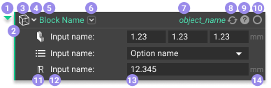
- Collapse
- Use the chevron to the left of the block to expand or collapse the block contents (hotkey Spacebar).
- Block Color
- The bar on the left of the block and the collapse icon represents the Output Type through colors. Read more here.
- Block Icon
- The icon represents the Block Type. You can see the list of all Block Types here.
- A list icon appears over the Block Icon if the block is a List.
- Block Type Overload
- Change the Block Type by using the chevron beside the Block Icon (not every block can have its Type overloaded).
- Block Name
- The name of the block. Use this name for adding a block to your Notebook through the Search bar, Ribbon, or Context Search.
- Overload
- The chevron to the right of the Block Name is for overloading block inputs. Read more here.
- Object Name
- The automatically generated name of the specific block.
- Rename it by double-clicking on the text.
- Rebuild Block Icon
- When the block needs to be rebuilt, this icon appears—rebuilding reruns the block. Click the icon to rebuild the block.
- Block Details
- This icon opens up the Block Details panel. The Block Details contains a tab for Properties, Display, and Comments. The Information tab material as well as some of the contents from the Display tab has been moved to the Right Side Panel. Read more here.
- The color of the Block Details icon changes depending on the status of the block.
- Blue: Unbuilt block.
- Grey: Block built successfully.
- The icon changes shape if a block encounters a warning or error.
- Yellow: Warning. You can still use the block results, but it may not be optimal.
- Red: Error. You need to fix the error to run the block. Read more here.
- Visibility Icon
- This icon indicates if the block output is visible in the Viewport. Toggle this by selecting the block and pressing V.
- Solid circle: The block is visible.
- Empty circle: The block is invisible.
- This icon indicates if the block output is visible in the Viewport. Toggle this by selecting the block and pressing V.
- Input Icon
- Each input has an icon to specify the Output Type of that input.
- Input Name
- Describes the input.
- Input
- Click in the input to type in a value or a Block Name. Typing in a Block Name opens up a search, where blocks within the Notebook show up first and then all other relevant blocks that satisfy the input type.
- The input is outlined in red if it is an unacceptable input.
- You can drag and drop blocks into inputs.
- Units
- Units appear to the right of the input. Read more here.
Variables
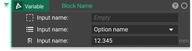 You can tell a block is a variable because the Object Name is on the left and the Block Color highlights it. Read more here.
List Block
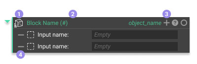
- List Icon
- List blocks have a list icon that appears over their regular icon.
- List Size
- The block name updates to show the size of the list, where the number between the brackets is the list size.
- Add Inputs
- Add additional inputs to lists by using the ’+’ icon in the upper right corner of the block.
- Remove Inputs
- Remove inputs using the ’-’ that appears when you hover over an input.
Custom Blocks
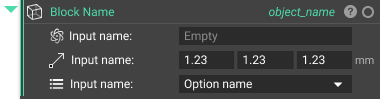 All Custom Blocks have a double line down the left side of the block. The double line tells you that it is a Custom Block with a workflow running underneath the hood. Read more here.